18/02/18

Above is a made up magazine double page spread featuring a large image and modern minimalist style using clean colours and sharp lines to outline each image. The right page is split into 3 distinct columns, the first for images covering the topic. The font used is a more modern sans-serif well used as a very clear font easy to read and clear to the reader at a distance. The black on white very commonly used in magazines works well in this instance to separate the text from the images. This is clearly a first take at magazine however as the image on the left is cropped and cut poorly where you can see the edges from the original source, i really like the overlap of the image on the second page and how the text is forced to move around it almost like a flowing river of information. I think the orange colour scheme could be explored further in the images and could have been the more prevalent colour in each image. Also the title of the article and article writer is missing as well as the publications actual name itself, this can be blamed on the fact that this was clearly one not actually made for print.
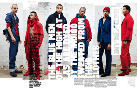
For my second magazine spread i looked for a more editorial and non-conforming style which i found in Neville Brody’s magazine with Arena Homme. Neville is a famous graphic designer based in london and had created a whole new typeface for this magazine takeover. Clearly his goal is to throw out conventional rules and styles, however at a point i think he’s lost sight of the purpose of a magazine to spread information and images. I have no clue where to look first and struggle to read the black text on the red image, even if the point is a sense of misunderstanding. I enjoy the white text but dislike the rag as it looks so disjointed I can’t tell if its a fully formed text or just random segments of words aligned together.

My 3rd magazine is this article in the Q music magazine in early 2012 about the artist Lana del ray. The left page is designated for a portrait of Lana herself in a style very reminiscent of her music videos. The right side of the spread is then dedicated to information and the article itself, Im at first confused as to where to start but the large ‘S’ indicates I start below. The font used is a more modern serif with triangle serifs, the rag of the initial paragraph is very skewed but readable, i prefer sans-serifs as they are easier to read and better at presenting a article. However can take away from the feel of the article so maybe a larger gap between base lines to ensure there is a large space for reading. I dislike the change in font size between the first and following paragraphs seems disjointed and as if they are just trying to fill the page.

A double page spread in the renown magazine TIME. Each page split into 3 thick columns full of text from half way down, leaving the top to images or illustrations. The background of the spread is an illustration depicting the loss of support in form of state stars for the former president of the US. I really dislike the fact that the illustration covers the entirety of the page as its so distracting and makes some of the text hard to read. Thankfully the font used is extremely clean and contrasts well to the background with a small serif and thick lettering. I enjoy the initial(drop cap) at the beginning of each page as it gives a clear direction of how to interpret and read this text.

I love this design, clearly a well thought out design incorporating the image with the subject of the text using characters as a gradient border with the yellow background on the right. The right page is split into 3 columns the first being empty. The typeface is a sans serif for the title and a slab serif for the paragraph texts, this works well as the text is extremely clear and easy to read with the black contrasting well to the mellow yellow. However the sub-heading colour does not work as its difficult for me to read and could be difficult for people with impaired vision or dyslexia.
These 5 designs have given me a lot of inspiration for my oncoming work i look forward to making a modern take of politics from the point of view of a kid who grew up bombarded by horrifying news, about how the elite rules the world using their billions to keep us in line. Before i get too philosophical i think that’s where I will end this post.

Leave a comment